As CEO of a company that’s been building and enhancing college websites since 2008, I’ve collaborated with many college program directors to develop sites that meet their specific program goals.
While helping college programs of all shapes and sizes, I’ve noticed that the best college sites are not only doing specific things right, but they’re doing the same things right. Because they share these commonalities, a review of these sites can show us best practices that you might consider applying the next time you update your program site.
To inspire you, I’d like to offer this checklist of what the best college sites do. Use it to not only identify what you’re already doing right—check those off as you go—but also to discover tried-and-true ideas that you might not have come across during your site creation process.
1. They accomplish not just any goal, but their specific goal.
The best sites use a tool like Google Analytics to answer questions like these and make data-driven decisions based on those answers:
- Is the site attracting students? If so, how many? What caliber of student is it attracting?
- Is the site increasing enrollment? At what rate?
- Is the site compelling alumni to contribute funds? If so, how much money?
- Is the site helping current students find the resources they need? Which resources are they finding, and which resources are difficult to locate? Is the site reducing the need for actual people answering phones and assisting students in person?
Your action: Determine your site’s goal. Is your current site meeting it? Figure out the answer through questions like those listed above. If yes, check this off.
2. They appeal to their most important visitors first.
What better way to explain this point than to show you an example? The creators of this Denver Seminary site recognize its target audience and know what information these visitors seek. You can tell because this site delivers this information and doesn’t make it difficult to find it.
Your action: To maximize site effectiveness, here are the steps that I suggest to clients:
- Identify your target audience.
- Determine what your target audience is looking for on your site.
- Make sure that information appears front and center.
Done? Check this one off.
3. They pave a clear path for action.
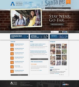
Once prospective students show up, the best sites like this University of Texas Arlington one compel them to have a look around and take action.
Here are a few additional examples of calls to action designed to meet every possible type of prospect where they are in the process:
- Watch a Video
- Take a Virtual Tour
- Click Here for More Information
- Join Our Email Newsletter
- Apply for Admission
- Get Answers Here
- Register for Classes
Your action: This is a multi-step one. How many of the following have you already done? Check them off as you go.
- Identify the key information that your prospective students seek.
- Cut content down to the bare minimum.
- Highlight key information so it can be found in the first five seconds of scanning the page.
- Organize information on the page so it is easy to digest.
- Provide obvious links to deeper information so prospective students know where to click.
- Make sure pages load quickly so prospective students aren’t left hanging.
4. They convince prospective students that their program delivers results.
Polk State College touts economic success front and center on its homepage via slide show. These solid statistics show that their graduates are better off after attending their program, giving prospective students proof that their program is worth the financial investment.
Your action: Depends on your target audience. Is it prospective students? Ask yourself these questions:
- What percentage of your graduates found jobs in their desired field of employment in the first year following graduation?
- What salary range are your graduates are getting when they do find a job?
- What kind of ROI (return on investment) track record does your program have? Will the education pay off? Is this a wise investment?
More focused on existing students with the purpose of fundraising or seeking to engage them? Ask yourself these questions:
- Why should a student continue with your program? Will you meet this student’s needs quickly and effectively?
- Why should an alumnus contribute money? How are funds used? What emotional fulfillment will an alumnus get from contributing?
5. They make students fall in love with them.
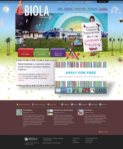
Take just one look at Biola’s Undergraduate Program site and you know exactly what kind of feel the college offers: fun, accepting, and eclectic.
The best sites offer an appealing program brand that generates enthusiasm and anticipation, forging an emotional connection with the prospective student so he or she can’t wait to enroll.
Your action: Reach out to your Creative Services department. They’re a great resource for this because they too are focused on giving your prospective students a taste of the flavor of your program through colors, style, logos, pictures, and videos.
Number 5 is pretty powerful so I think we’ll leave it at that. Be sure to check out the last five checklist items in our continuation of this post here.
