Wake Forest University Study Abroad Site Redesign
-
WordPress
-
Bootstrap
-
TerraDotta
The Challenge
While the Wake Forest University Center for Global Programs and Studies was already a flagship study abroad program, ranking #3 in the nation (as ranked by the Institute of International Education, publishers of Open Doors), they weren’t satisfied with their study abroad program participation numbers, which were hovering around 60-65%. WFU set their sights on a 75% student participation rate.
WFU knew their current study abroad web experience wouldn’t facilitate their goal to increase student participation. They also realized that they had to find a way to help more students understand that they can study abroad, resources are available to help them afford it, and that every student should consider the opportunity.
Additionally, WFU decided it was time to tackle a problem that had previously been acknowledged, but not conquered: the fact that a relatively untapped demographic existed among their student base. Liberal arts degree majors are typically predisposed to consider studying abroad, but another segment of the student population typically doesn’t – STEM students (Science, Technology, Engineering, Mathematics). While many study abroad programs exist for STEM students, participation rates in study abroad programs are low for these subject areas.
The Solution
Verified Studios set out to showcase the benefits of studying abroad, tapping into a student’s desire to explore, broaden horizons, and experience new places and cultures. We understood that the site needed to nurture students and make them feel that they can both handle and afford studying abroad. The site needed to simultaneously excite, entice, and offer support.
We started by interviewing current and past study abroad students to determine what appealed most to prospective participants. We also collaborated with WFU to determine how to most effectively highlight study abroad opportunities.
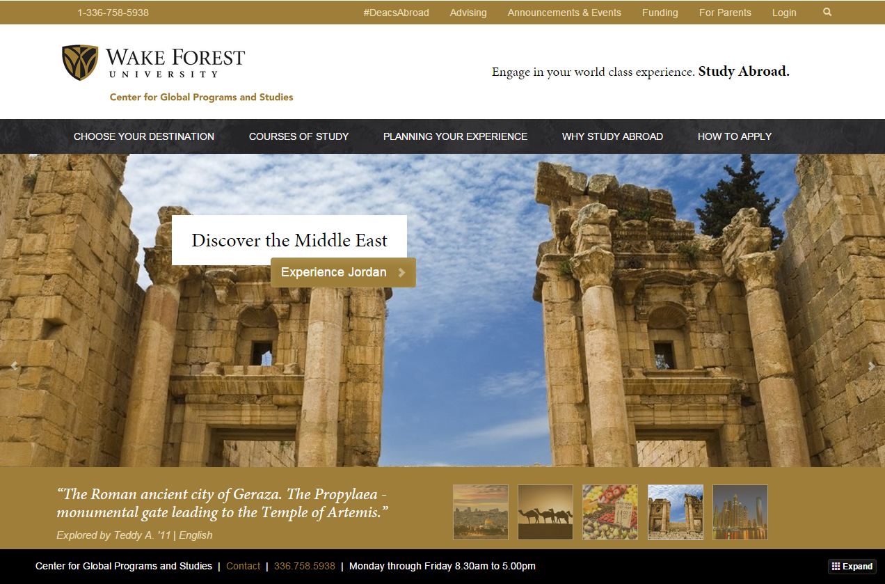
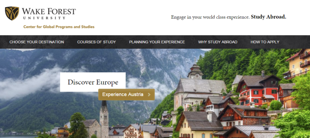
Using our new insights, we redesigned the site so that it helps students through the process of choosing where and what to study abroad. We organized content in such a way that students of all disciplines could quickly and easily find programs they otherwise might have overlooked. We also used gorgeous images of exotic destinations to awaken a sense of adventure and a desire to travel, complemented by an intuitive navigation that leads students deeper into the site’s content and encourages them to take action.
Our approach shifted the focus of the site, enabling students to find programs not only by location but also by subject. This shift opened doors for that untapped demographic, as STEM students can now quickly search by discipline without having to dig deep into the site to find the appropriate program.
After the new site launched, we helped WFU create an internal communications blitz in which we sent all departments relevant subject links so they could add study abroad opportunities to syllabus and course materials. We also added information and links to department level sites to integrate study abroad opportunities with the ordinary on-campus experience.
The Results
The newly designed site is beautiful, easy to use and engages students to build connections that lead to participation and commitment. Built in analytics will allow WFU to make decisions on future shifts in recruitment strategy to maximize the effectiveness of dollars spent. STEM related programs already account for almost 50% of the course of study traffic.


